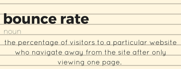
You're driving visitors to your website, but they are leaving before they have a chance to look around. "Bounces" off your page will lead to a higher bounce rate - but what does that mean for your website efforts?
A bounce is a single-page session on your site. In Google Analytics, a bounce is calculated specifically as a session that triggers only a single request to the Analytics server, such as when a user opens a single page on your site and then exits without triggering any other requests to the Analytics server during that session. So what does this mean in layman terms? It means that once people are brought to your site, something happens, or something doesn't happen, and they lose interest and leave your website.
Since the rise of the mobile revolution, the average human attention span has dropped from twelve seconds in 2000 to merely eight seconds in 2017. That means you only have EIGHT SECONDS to capture the attention of a website visitor. Factors like slow load time for the page or images will frustrate visitors and bombarding them with additional offers will steal their attention from your intended content. Some other factors that play into higher bounce rates include:
 Irrelevant & Unexpected Content. Visitors seeing something unexpected and unrelated to what they came for. Not everyone likes surprises. This tactic is often seen with click bait - the title of an article is intriguing enough to click, but the content isn't strong or relevant enough to keep your attention.
 Errors & Grammar. This is pretty self-explanatory—no one wants to read something that looks as if it was written by a six-year-old. It’s sloppy and unprofessional.
  Not having a clear next step. Having a clear call to action means the visitor knows quickly what their next step should be and where it is on the page.
When creating or editing your website pages, remember that simple page layouts can communicate a lot of information in a short period of time. Focus on what you really want the visitor to do on your landing page. Make sure all the copy, images, and call to action buttons are gently nudging people in that direction. Visitors will scan your landing page quickly to see if you have what they came to your site to find.
Ready to learn more about bounce rates? Check out our blog Busting Your Bounce Rate. Here, we break down five different ways you can improve your bounce rate
It’s Cyber Monday, and you know what that means… DEALS! DEALS! DEALS! It’s the second largest shopping day of the year, the day where online deals come by the thousands, the day when it’s okay to be glued to your computer screen. Only second to...
You’ve been told that optimizing conversion ensures great benefits—greater return on ROI, cost-effectiveness, increase in market share, but how do you know if it really worked? Continuously utilize these measurements to help you visualize your...
Take a moment to think about the goals for your website. Is having a high bounce rate on your site a really bad thing? Bounce rate is the percentage of visitors to a particular site who navigate away from the site after viewing only one page....
ABOUT
Marketing Services
HubSpot Services
Resources
CONTACT
267.982.4044
info@moderndrivenmedia.com
590 Lancaster Ave, Ste 110,
Malvern, PA 19355
Join Our e-newsletter